QT Gold Coast
Visual identity for this quirky and luxurious hotel located in one of Australia’s most iconic beachside destinations.
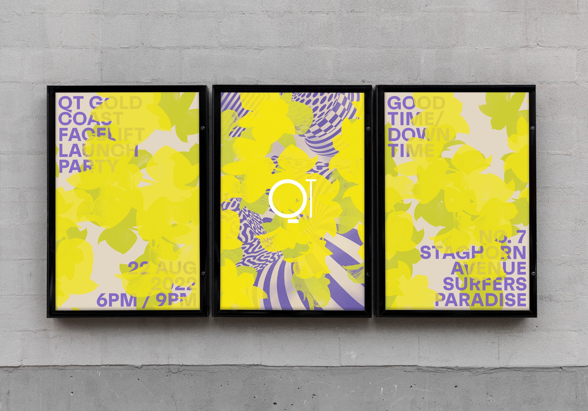
QT Hotels & Resorts celebrates individuality, creativity and the unconventional in a high-end hotel format. Every hotel is unique with location inspired concepts. The Gold Coast is one of Australia’s most iconic beachside destinations, with a laid back surf culture, as well as buzzing bars and venues. QT Gold Coast redesigned their hotel to be the leading destination on both fronts. In line with the overarching QT brand ethos, as well as the Gold Coast destination focus, the hotel needed an unusual yet sophisticated new brand identity.
Part resort, part vintage surf destination, part high energy playground—this visual identity encapsulates this new resort-style playground. The guest is invited to a high or low energy escape, the party and the chill, to the ‘good time / downtime’. Vintage inspired photographic patterns and contrasting sharp 3D typography are layered to express this unique vibrant hotel personality. The colour palette is vintage surf inspired, with some dialled up colours, creating some vibrant, quirky and playful moments that celebrate QT’s signature brand ethos.
Studio: Toben
Creative Directors: Thorsten Kulp, Katja Hartung
Design Director: Geoff Courtman
Awards: Graphis Design Awards Silver
Photography: QT Hotels, Toben
3D Illustration: Chris Thompson


